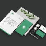
Rosha, paper production and sales
January 11, 2025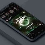
Night Voices, Cohesive Visuals Design
January 13, 2025_ Brand Identity
Café Typica
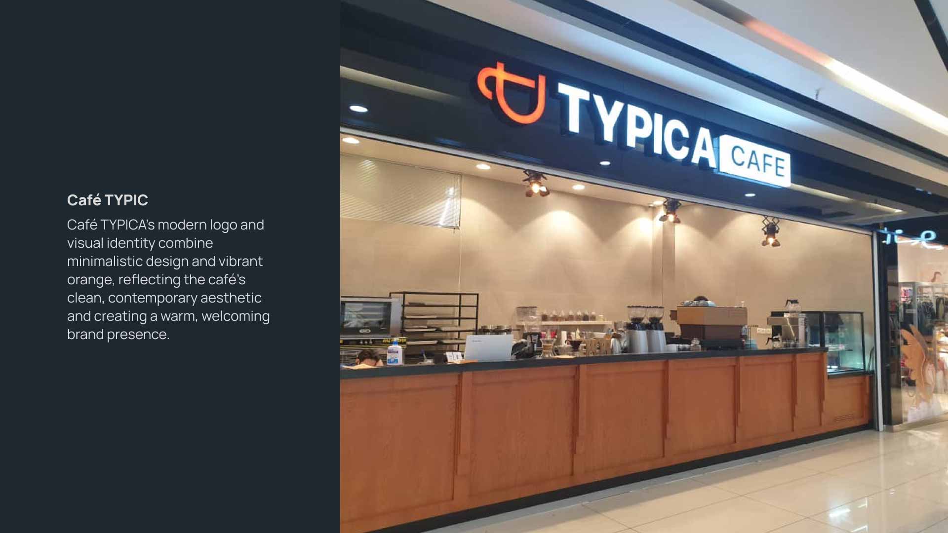
Creating a modern logo and identity for Café TYPICA, highlighting simplicity and contemporary elegance.
Rosha approached us to develop a visual brand identity that embodied their core product—paper—and their name's essence. To achieve this, we designed a logo that integrates the initial ‘R’ and a sheet of paper, symbolizing both the tangible nature of their products and their innovative approach to the industry.
Using green as the primary color, we reflected Rosha’s commitment to sustainability and eco-conscious practices. The result is a versatile, memorable logo that resonates with their audience and aligns perfectly with their brand values.
Consumer Connection
Market Differentiation
Brand Recognition Boost


Rosha, a brand specializing in paper production and sales, sought a logo and visual identity that would set them apart. Our approach involved combining the letter ‘R’ with a paper-inspired design, a concept that seamlessly tied their name to their primary product. Green was chosen as the logo’s color to emphasize sustainability, a key aspect of their brand ethos. The final design not only captured the essence of paper but also communicated professionalism and environmental awareness, creating a strong connection with Rosha’s target audience and laying a foundation for a recognizable and impactful brand identity.